|
Territories have been grouped into regions, based on geographical proximity. There are often similarities within the regions, as well as huge differences. Still there are patterns in the relationships between regions where people in certain areas have less money, more disease and shorter lives in contrast to those living in other regions. The table below lists the regions from poorest to richest, and provides some details about each.
The regions each have a set of colours so that territories can be located within that region. The colours used on the map correspond to the colours used on the graph and tables of the poster series. The rainbow scale shows the positions of territories in the Human Development Index.
This map shows all territories as roughly the same size, to indicate their inclusion. | 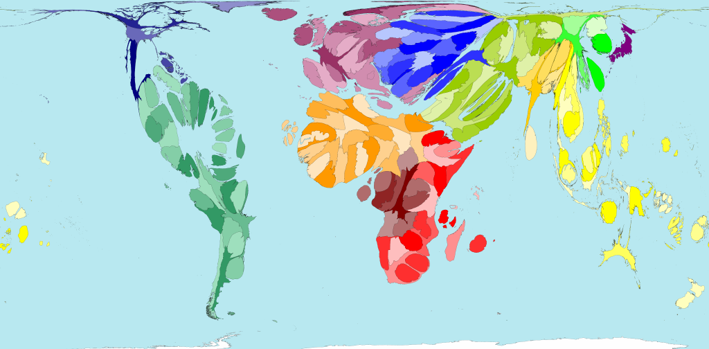
 Open Population Map for comparison